Scribbled Lives Week 16—Practice
This week provided a welcome opportunity to explore anything we wanted—to delve deeper into a topic—before sharing what we learned with the group.
After creating built-up lowercase letters for last week’s Voltaire quote, it seemed appropriate to design letters for the remainder of the alphabet! To design the pencil letters, I chose a short pangram—a sentence that contains all 26 letters of the alphabet.
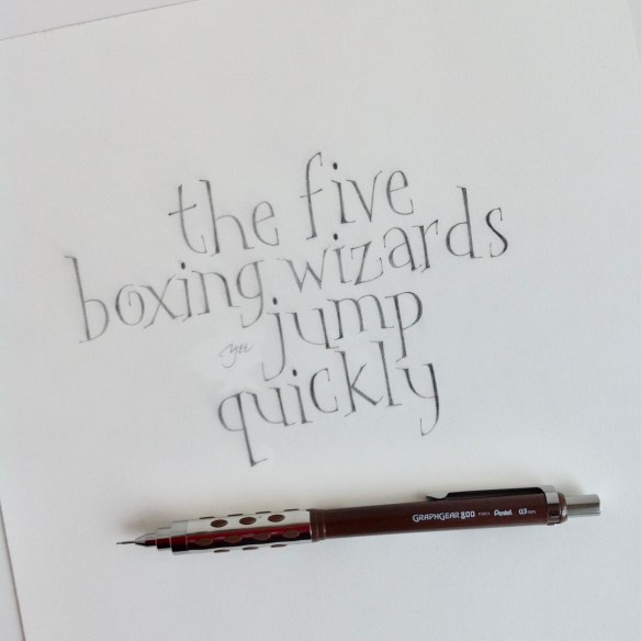
Since taking Yves Leterme’s built-up capitals class, I have fallen in love with pencil lettering. It is slow art, for sure! It’s only for those nerdy enough to willingly spend five minutes drawing one letter with a thin pencil lead. However, it gets me into the zone, and I’m lost in the nuances of shape and line quality. My goal is to make letters that loosen up and dance! Hopefully, more experimentation will generate letter variations! That’s the beauty of hand lettering over type.
What did I learn? Fabriano 90# HP offers a smooth surface and is well sized for corrections as I learn to nestle and bounce letters.
For several months, I’ve been wanting to complete a book I started in a Laurie Doctor workshop; the pencil letters seemed perfect for the section headings of the book.
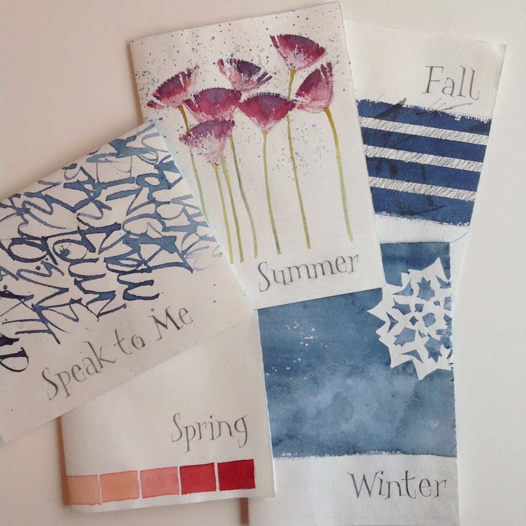
Lessons from book section headings—Arches Text Laid has some tooth and is less eraser-friendly, especially after one or two corrections! If I were more patient, a kneaded eraser might work better.
Graphite—Mechanical pencil using 0.3 mm Staedtler Mars Micro Carbon HB leads. Pencil work became smudgy as the book pages were assembled, so I applied three layers of spray fixative for protection. Aerosols are not my first choice; I’m on the lookout for a more environmentally friendly option to preserve artwork.
More on the book after it’s bound.
