I’ve been drawn to the style of Charles Rennie Mackintosh…probably forever. Over five years ago, I designed a version of his Art Nouveau lettering for a commission and called it Willow.
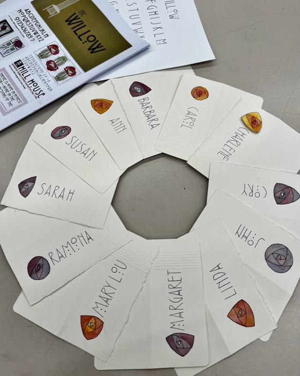
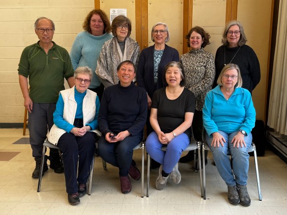
On the weekend, it was my pleasure to share it with participants in a workshop hosted by the Calligraphic Arts Guild of Toronto. We examined type fonts inspired by Mackintosh; practiced the 26 letters and their variations; admired Art Nouveau stained-glass designs; discussed composition, colour mixing, and corrections. A varied curriculum that came out of student questions. Not quite what was planned but meeting the needs of a mix of participants who were either new to hand lettering or preparing for the CAGT’s upcoming annual gallery exhibition. Lots of alphabet practice leading to composition studies of the quotations they were exploring. I can’t wait to see the finished broadsides in the gallery exhibition.
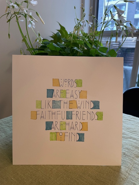
In the meantime, student Linda Sutherland shares a card she created.
Capturing a moment in time at the end of a satisfying day!