Creating an eye-catching page layout takes an artistic touch.
Joshua Johnson is a web designer with some well-tested tricks in his toolkit. If you encounter designer’s block, consider Joshua’s 10 Rock Solid Website Layouts. Keep these alignments on your drawing board when you are stuck. Or before you get stuck.
- Three Boxes
- 3D Screenshots
- Advanced Grid
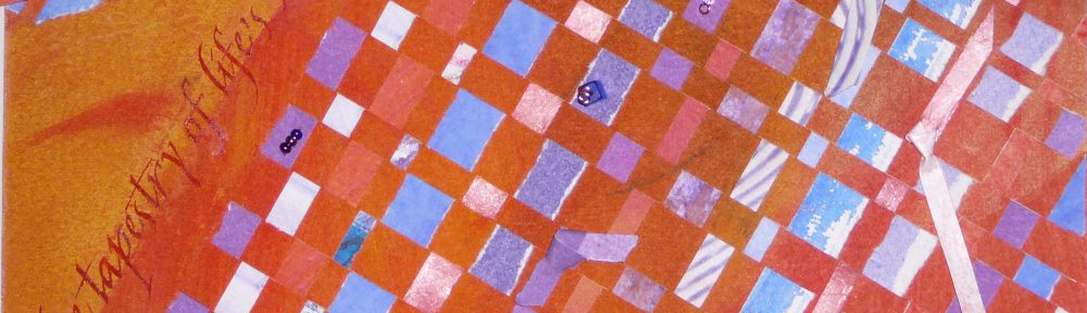
- Featured Graphic
- Five Boxes
- Fixed Sidebar
- Headline and Gallery
- Featured Photo
- Power Grid
- Full Screen Photo
Basic principles:
- Choose an alignment
- Design to include whitespace
- Highlight important elements through sizing and positioning
To familiarize myself with his layout concepts, I searched the web for samples of my own to share with you.
Three Boxes
The three boxes layout features one main graphic area followed by two smaller boxes underneath. Each box can be filled with a graphic, a block of text, or a combination of the two.

3D Screenshots
Provide a headline and descriptive text, then add stylized previews of your application using 3D effects.

Advanced Grid
Similar to the three boxes layout, use one primary graphic heading followed by a uniform grid of thumbnails. To add interest, merge some of the thumbnails to create areas of differing shapes. These areas can contain graphics, blocks of text, or a mix of both.

Featured Graphic
Sometimes you don’t have enough images or you want to highlight one icon, photo or symbol. An effective solution is to feature one strong graphic.

Five Boxes
The five boxes layout expands on the idea of the three boxes layout to accommodate the inclusion of more distinct content. Of course, the secondary boxes become smaller.

Fixed Sidebar
Fixed vertical navigation features a strong vertical column on the left or right side of the page. The fixed element stays in place so that navigation is accessible from any point on the site. Design the rest of the page incorporating any of the other layout options.

Headline and Gallery
A gallery page is very visual. Use a headline, an optional sub-head, and then showcase a solid, uniform grid of images. Make the headline big and bold.

Featured Photo
Feature one large image showcasing your design, artwork, or photography, then add a navigation system.

Power Grid
For pages that contain a variety of related content, the power grid may be an effective solution. Define a large container to hold a series of shapes formatted in a strong but varied grid. In the example below, a defined container holds columns of variously-sized content boxes.

Full Screen Photo
Use one large, attractive graphic as a background to display a limited amount of content. Content laid over a background image can be difficult to read, so ensure that navigation is clear. Perhaps use an opaque horizontal bar to hold navigational elements.

Hope these layouts inspire your next design project!
Related articles
- Grid-Based Layouts 101 (designfestival.com)
 An Artist's Journey